I got the print proof this week. I note for future reference: that’s two weeks from ship date, plus four days from proof submission.
The thing in hand, I think a print edition is worth the paper and the effort necessary to get it into shape. A few corrections to be made:
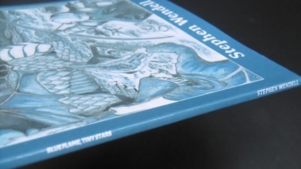
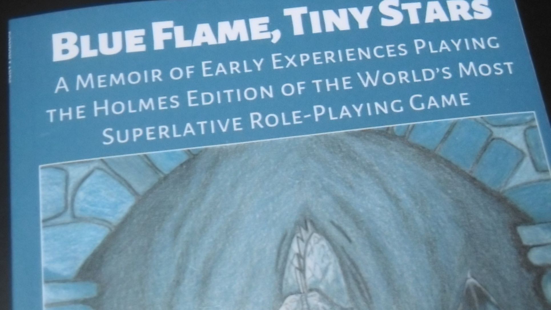
The background blue is supposed to match the website header. Printed, it looks washed-out.

At 0.13 inches, the spine is just wide enough to allow text. I put the title, author, and publisher (not shown) in different sizes to see how they look. In printing, the cover suffered a slight rotation, which shows in the tight space—the text creeps off the spine. Including text on a narrow spine is like casting a spell through a steel sword on Tékumel: just because you can doesn’t mean you should. Spine text to be removed.

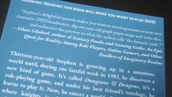
The graphic elements, which fill the allowed (printable) space, don’t breathe on the front or back covers.
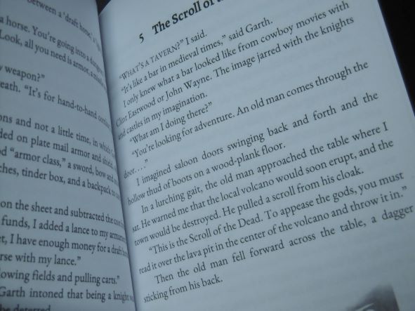
At current margins, font size, and 5″ × 8″ trim, the interior text breaks at all the right places. The font size is just right, but the margins look a little tight, and the gutter (interior margin) is far too narrow. Instead of reducing the font size, I’ll add a half-inch to the trim to widen the margins. At 5½″ × 8½″, the front and back covers also breathe.

I hope those who opt for print will agree that color on the few interior images are worth an extra buck.
Another proof is necessary. That will push release date into the holiday season, a period of increased competition for reader attention and spending money. A nice-looking product is worth it.

It’s a challenge to create a printed book. I agree: it’s worth the time and effort to order a proof. I do it every time. Good luck. The next one will be easier with the experience gained.
Thank you for the encouragement, Diane!
So it is indeed a printer’s devil that is in your details. The rituals of banishment thereof are clearly long, intricate and fatiguing. Good luck & perseverance!
Thanks, Davoid.
Pingback: Blue Flame, Tiny Stars—December Release – DONJON LANDS